


Last updated: June 15, 2026
Most developers assume accessibility costs extra time. Headless UI proves the opposite.
If you have ever built a dropdown menu from scratch and then spent three days fixing keyboard navigation, screen reader announcements, and focus trapping, you already understand the problem Headless UI solves. The library – maintained by the Tailwind CSS team – ships fully accessible, unstyled components for React and Vue. You get the behaviour and the ARIA attributes for free. You keep total control over the visual design. That shift in ownership is what makes headless UI components genuinely useful for agencies building client sites in 2026.
This guide walks through installing Headless UI, wiring it up with Tailwind CSS, and building a real accessible dropdown – the kind that works correctly with a keyboard on the first attempt.
Prerequisites – What You Need Before Starting
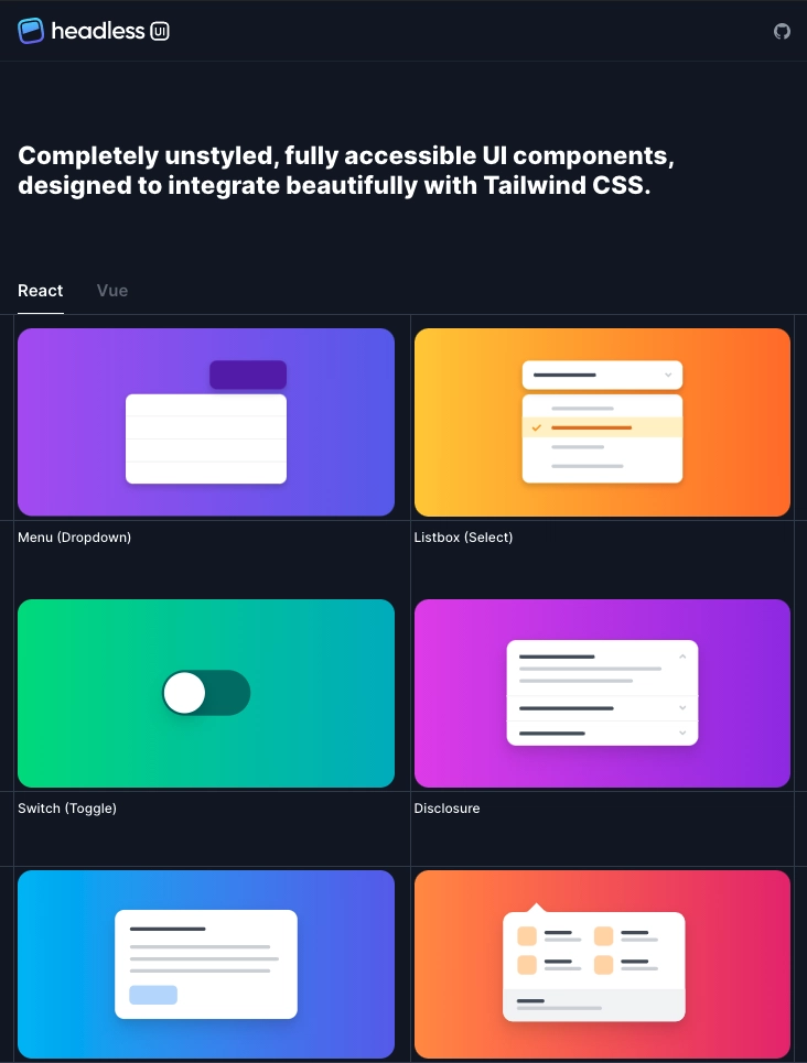
Image: dev.to
You need Node.js 18 or later, a React 18+ or Vue 3 project, and Tailwind CSS v3 or v4 installed. Familiarity with JSX (or Vue’s single-file components) is assumed, but you do not need prior experience with any component library. If you are working in a decoupled architecture – for instance a headless WordPress setup decoupling frontend and backend – Headless UI fits naturally alongside your existing React or Vue frontend.
Step 1: Install Headless UI
Installing Headless UI takes one command and zero configuration.
For React:
npm install @headlessui/react
For Vue:
npm install @headlessui/vue
That is the entire setup. There is no theme file to configure, no design token system to map, and no global stylesheet to import. Headless UI ships zero CSS by default – it manages state and accessibility semantics only. This is the core design decision: the library handles what CSS cannot (keyboard events, ARIA roles, focus management), and leaves what CSS handles well (visual appearance) entirely to you.
Step 2: Build an Accessible Dropdown Menu
The Menu component is the clearest demonstration of why headless UI components save meaningful development time. Here is a minimal React implementation:
import { Menu } from '@headlessui/react'

function ActionMenu() {
  return (
    <Menu as="div" className="relative inline-block">
      <Menu.Button className="px-4 py-2 bg-indigo-600 text-white rounded-md">
        Options
      </Menu.Button>
      <Menu.Items className="absolute mt-2 w-48 bg-white shadow-lg rounded-md ring-1 ring-black/5 focus:outline-none">
        <Menu.Item>
          {({ active }) => (
            <a
              href="/edit"
              className={`block px-4 py-2 text-sm ${active ? 'bg-indigo-50 text-indigo-900' : 'text-gray-700'}`}
            >
              Edit
            </a>
          )}
        </Menu.Item>
        <Menu.Item>
          {({ active }) => (
            <button
              className={`block w-full text-left px-4 py-2 text-sm ${active ? 'bg-indigo-50 text-indigo-900' : 'text-gray-700'}`}
            >
              Delete
            </button>
          )}
        </Menu.Item>
      </Menu.Items>
    </Menu>
  )
}
Notice the active render prop. Headless UI surfaces interaction state – hovered, focused, checked, selected – as props you can use directly in your Tailwind class logic. You are not fighting the library’s default styles; there are none. The component automatically manages role="menu", aria-haspopup, aria-expanded, and arrow-key navigation. Good web accessibility content practices matter for every client site, and this approach makes compliance the default rather than the afterthought.
Step 3: Style with Tailwind Using the data-* API (v2+)
From Headless UI v2, the library exposes component state via HTML data-* attributes. This means you can write accessibility-driven styles purely in Tailwind without render props:
<Menu.Item
  as="a"
  href="/edit"
  className="block px-4 py-2 text-sm text-gray-700 data-[active]:bg-indigo-50 data-[active]:text-indigo-900"
>
  Edit
</Menu.Item>
Cleaner. Consistent with how Tailwind handles other state variants. This approach scales well across complex component trees because the styling logic stays inside the class string rather than in conditional expressions.
Step 4: Before/After – Custom Select vs Listbox
The Listbox component is where the headless pattern earns its strongest argument. Here is what the two paths actually look like in practice.
Building a custom <select> replacement from scratch means writing a controlled open/close state, trapping focus inside the list when open, wiring keyboard events for arrow keys, Home, End, and Enter, adding role="listbox" and role="option" with correct aria-selected and aria-activedescendant attributes, and then handling the edge cases: what happens when the list overflows the viewport, when the user tabs away, when an option is disabled. A senior developer building this correctly – including a round of screen reader testing – typically spends one to two full days. Skipping the edge cases means shipping something that silently fails for keyboard and assistive technology users.
Using Listbox from Headless UI looks like this:
import { Listbox } from '@headlessui/react'

function StatusPicker({ value, onChange }) {
  const options = ['Draft', 'Published', 'Archived']
  return (
    <Listbox value={value} onChange={onChange}>
      <Listbox.Button className="px-4 py-2 bg-white border rounded-md text-sm">
        {value}
      </Listbox.Button>
      <Listbox.Options className="absolute mt-1 w-48 bg-white shadow-lg rounded-md ring-1 ring-black/5">
        {options.map((option) => (
          <Listbox.Option
            key={option}
            value={option}
            className={({ active, selected }) =>
              `px-4 py-2 text-sm cursor-default
               ${active ? 'bg-indigo-50 text-indigo-900' : 'text-gray-700'}
               ${selected ? 'font-medium' : ''}`
            }
          >
            {option}
          </Listbox.Option>
        ))}
      </Listbox.Options>
    </Listbox>
  )
}
The ARIA wiring, keyboard handling, and focus management are already done. You are writing Tailwind classes to match your design. The same end result that took two days now takes roughly two hours – and the hour you spend is on the visual layer that actually reflects your design system, not invisible infrastructure.
Step 5: Compose More Complex Components
Headless UI includes more than just menus. The full component set covers dialogue (modal), Disclosure (accordion), Listbox (custom select), Combobox (autocomplete), RadioGroup, Switch (toggle), Tab, and Popover. Each follows the same contract: you receive state and event wiring, you supply the markup and styles.
The dialogue component, for example, gives you focus trapping, scroll locking, backdrop click-to-close, and the aria-modal attribute. Note that dialogue does not portal its content into the document body by default – if you need the overlay to escape a stacking context, wrap it using React’s createPortal or position it at the root of your component tree. For agencies quoting accessibility compliance as part of a WooCommerce build or custom web application, this kind of built-in coverage meaningfully compresses estimated development time for interaction-heavy UI.
Step 6: Verify Accessibility in Practice
Building with Headless UI gives you a strong foundation, but accessibility still needs to be tested. The library handles the ARIA semantics; you need to confirm your visual styles do not accidentally break the experience.
Keyboard testing checklist:
– Tab into the component. Does focus land on the trigger?
– Press Enter or Space to open. Does the menu or listbox open?
– Use arrow keys to move between options. Does focus move correctly?
– Press Escape. Does the component close and return focus to the trigger?
– Tab away from an open component. Does it close without trapping focus?
Run through this sequence every time you ship an interactive component. It takes under two minutes per component.
Screen reader testing does not require specialist equipment. On macOS, VoiceOver is built in – press Command + F5 to activate it, then navigate your component with the keyboard. On Windows, NVDA is free. The things to listen for: does the screen reader announce the component role (e.g. “menu” or “listbox”)? Does it announce the current item as you navigate? Does it announce expanded or collapsed state on the trigger?
Automated tools such as axe (available as a browser extension or via @axe-core/react) catch the structural issues – missing labels, incorrect roles – but cannot replace the keyboard and screen reader walk-through for interactive components. Use both.
Myth vs Reality: “Unstyled Means More Work”
The myth: unstyled component libraries make projects slower because you write all the CSS yourself.
The reality: the time you save on accessibility logic – focus management, ARIA wiring, keyboard navigation, roving tab index – is almost always larger than the time spent applying Tailwind classes. The work you do in CSS is visible in your design system and reusable across projects. The accessibility wiring, if you write it manually, is invisible infrastructure that has to be re-invented every time.
Unstyled does not mean from scratch. It means you own the right half of the problem.
Troubleshooting – Common Pitfalls
Focus styles disappearing. Tailwind’s preflight resets outline globally. If your focused menu items look unstyled, add focus:ring or focus-visible:ring classes explicitly, or configure outline in your Tailwind theme. Never remove focus indicators entirely – they are required for keyboard navigation.
Z-index issues with dialogue and Popover. If your modal or popover appears beneath other elements, check that no parent element has transform, filter, or will-change applied – these create isolated stacking contexts that cap the z-index of children. Set z-50 or higher on the dialogue.Panel or Popover.Panel, and if necessary restructure the component tree so the overlay renders close to the document root.
Vue reactivity not updating open state. In Vue 3 with the Composition API, make sure you are not accidentally passing a raw boolean instead of a ref. Headless UI’s Vue components expect reactive values where the docs show v-model.
Where to Go Next
From here, explore the official Headless UI documentation for the full component API, including transition utilities for animating open/close state with Tailwind’s Transition component. Pair the library with Tailwind UI (the paid component kit from the same team) if you want production-ready visual designs built on top of the same primitives. For teams building design systems, Headless UI components make an excellent foundation: accessibility handled at the base layer, visual tokens applied by your design system on top.
The underlying principle extends beyond this one library. Separating behaviour from appearance – the headless pattern – is how robust UI gets built at scale. Less fighting the framework. More shipping.
If you are building a web application or marketing site that needs to meet accessibility standards without sacrificing design flexibility, DRS Web Development builds custom websites and web applications for businesses of all sizes. Get in touch at drs-web.co.uk/contact for a free consultation.
Frequently Asked Questions
Q: What are headless UI components?
A: Headless UI components are unstyled, fully accessible UI elements – such as dropdowns, modals, and tabs – that manage behaviour and ARIA attributes without imposing any visual design. You apply your own styles using a framework like Tailwind CSS.
Q: Does Headless UI work with both React and Vue?
A: Yes. Headless UI ships separate packages for React (@headlessui/react) and Vue (@headlessui/vue), each with idiomatic APIs for the respective framework.
Q: Is Headless UI free to use?
A: Yes, Headless UI is open source and free. It is maintained by the Tailwind CSS team. Tailwind UI, the separate paid kit that uses Headless UI under the hood, is a distinct product.
Q: How does Headless UI handle keyboard navigation?
A: Keyboard navigation – arrow keys, Enter, Escape, Tab focus management – is built into each component by default. You do not write any event handler logic yourself; the library handles the full WCAG-compliant interaction pattern for each component type.
Q: Can I use Headless UI without Tailwind CSS?
A: Yes. Headless UI has no dependency on Tailwind CSS. You can apply any CSS approach – utility classes, CSS modules, styled-components – because the components render no styles of their own.
Q: How do I test that my Headless UI components are actually accessible?
A: Run a keyboard walk-through on every interactive component: Tab to the trigger, open with Enter or Space, navigate with arrow keys, and close with Escape. Then test with a screen reader – VoiceOver on macOS or NVDA on Windows are both free. Supplement with the axe browser extension for automated structural checks.
Source: https://headlessui.com/
This article was researched and written with AI assistance, then reviewed for accuracy and quality. Riya Shah uses AI tools to help produce content faster while maintaining editorial standards.
Need help with your web project?
From one-day launches to full-scale builds, DRS Web Development delivers modern, fast websites.
