


Image: Ahmad Shadeed (64KB)
For over a decade, responsive design meant one thing: media queries. You checked the viewport width, applied styles, repeated. It worked — until it didn’t. The moment you dropped a component into a sidebar, a modal, or a dashboard widget, your carefully crafted breakpoints fell apart. The layout knew how wide the screen was, but not how much space the component actually had. That mismatch has haunted front-end developers since 2010. CSS Container Queries are the fix developers have been asking for since Ethan Marcotte coined “responsive web design” — and as of 2024, they are baseline-supported across all major browsers.
The numbers tell the story plainly: as of early 2026, global browser support for CSS Container Queries sits at over 93%, covering Chrome 105+, Firefox 110+, Safari 16+, and Edge 105+. The Can I Use browser support table tracks this in real time. If you have been waiting for the “safe to ship” moment, that moment has arrived.
What Are CSS Container Queries and Why Do They Matter?
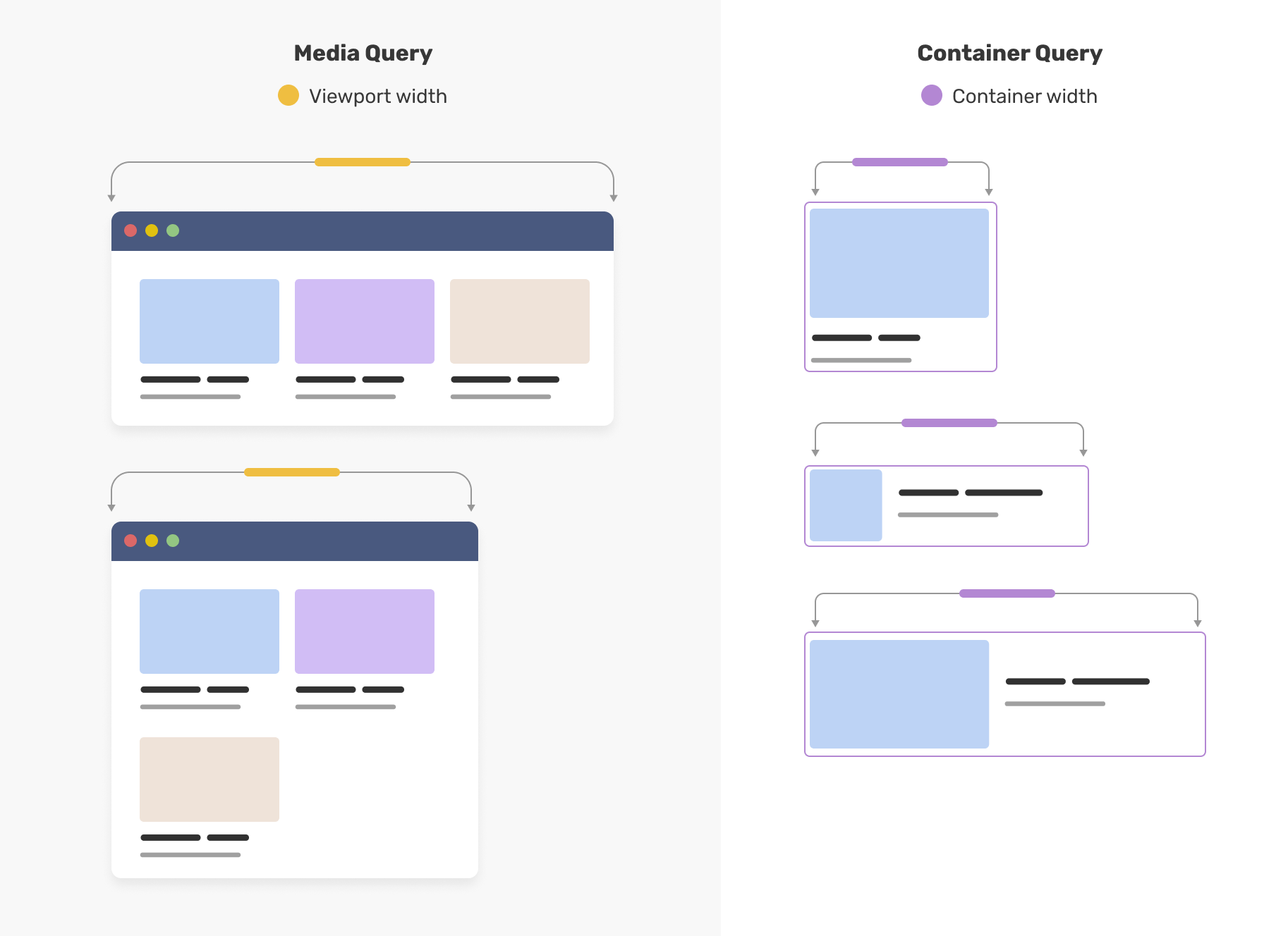
Container queries solve a problem that media queries never could: they let a component respond to the size of its parent container, not the size of the viewport. A card component inside a narrow sidebar can display in a stacked layout; the same card inside a wide main content area can switch to a horizontal layout — automatically, with no JavaScript, and with no knowledge of the page structure.
The mechanism is straightforward. You mark an element as a containment context using container-type, then write @container rules that fire when that container crosses a size threshold. The component becomes truly self-contained — it carries its own responsive logic rather than depending on the page to arrange it correctly. The full specification lives in the W3C’s CSS Containment Module Level 3, and MDN’s container queries reference is the definitive practical guide.
This matters enormously for design systems and component libraries. Previously, a reusable card or widget had to be designed for a specific column width, or you had to pass explicit size props through JavaScript. With container queries, the component itself knows its environment. If you are building a website from the ground up in 2026 — as covered in How to Build a Website from Scratch in 2026 and Go Live in One Day? — container queries should be part of your baseline CSS strategy, not an afterthought.
How Container Queries Work in Practice
The syntax is deliberately close to media queries, which lowers the learning curve. To define a container, you add two properties to a parent element: container-type: inline-size (or size) and optionally a container-name. Then, inside a child element’s styles, you write an @container rule.
Before — the classic media query trap:
/* The card assumes it knows how much space it has — it doesn't */
@media (min-width: 768px) {
  .card {
    display: flex;
    flex-direction: row;
  }
}
Place that card in a 300px sidebar on a 1440px desktop screen. The media query fires, the horizontal layout kicks in, the card overflows. The viewport lied.
After — container queries tell the truth:
.card-wrapper {
  container-type: inline-size;
  container-name: card;
}

@container card (min-width: 400px) {
  .card {
    display: flex;
    flex-direction: row;
    gap: 1rem;
  }
}

@container card (max-width: 399px) {
  .card {
    display: flex;
    flex-direction: column;
  }
}
When .card-wrapper is 400px or wider, the card goes horizontal. In a narrow sidebar, it stacks. The viewport width is irrelevant.
React Component Example
In a component-driven project, co-locate the container declaration with the component wrapper. Here is a production-ready pattern using CSS Modules and React:
/* Card.module.css */
.wrapper {
  container-type: inline-size;
  container-name: card;
}

.card {
  display: flex;
  flex-direction: column;
  gap: 0.5rem;
  padding: 1rem;
  border-radius: 8px;
  background: var(--surface);
}

@container card (min-width: 400px) {
  .card {
    flex-direction: row;
    align-items: center;
  }

  .card__image {
    flex: 0 0 120px;
  }

  .card__body {
    flex: 1;
  }
}
// Card.jsx
import styles from './Card.module.css';

export function Card({ image, title, description }) {
  return (
    <div className={styles.wrapper}>
      <article className={styles.card}>
        <img className={styles.card__image} src={image} alt="" />
        <div className={styles.card__body}>
          <h3>{title}</h3>
          <p>{description}</p>
        </div>
      </article>
    </div>
  );
}
Drop this Card into a sidebar, a product grid, or a modal — it adapts with zero props and zero JavaScript. That is the payoff.
Beyond size queries, the spec also includes container style queries, which let you query computed style values on a container — toggling dark/light variants based on a parent’s color-scheme, for example. Style queries are newer and browser support is partial: as of early 2026, @container style() is supported in Chrome 111+ and Safari 18+, but Firefox support is still incomplete per the MDN compatibility table. Treat style queries as progressive enhancement only; inline-size queries are what you should be shipping now. Pairing container queries with a well-chosen tech stack in 2026 — one that favours component-driven architecture like React, Vue, or Svelte — makes the developer experience seamless.
Migration Checklist: Retrofitting an Existing Component Library
Container queries are additive. You can adopt them component by component without touching anything else.
Step 1 — Identify candidate components. Cards, media objects, data tables with optional columns, nav patterns — anything that behaves differently depending on column width. These have the highest payoff.
Step 2 — Add container-type to the wrapper. Every well-structured component already has a wrapper element. Add container-type: inline-size to it. Add container-name if you plan to nest containers or need to target a specific ancestor.
Step 3 — Convert media query rules to @container rules. A @media (min-width: 768px) becomes @container (min-width: 400px) — but recalibrate the threshold. Media breakpoints are viewport-relative; container thresholds should reflect the component’s own layout inflection point, which is usually a smaller number.
Step 4 — Delete JavaScript size detection. If your components use ResizeObserver or a library like react-container-query, remove it. The browser handles it natively now.
Step 5 — Test across layout contexts, not just breakpoints. Place every component in every context it appears: sidebar, full-width, modal, grid cell. Playwright visual snapshots or Percy diffs are the most reliable way to catch regressions across all those combinations.
Tailwind CSS Integration
Tailwind added container query support in v3.2 via the @tailwindcss/container-queries plugin, and it is built directly into Tailwind v4 with no plugin required.
Tailwind v3 setup:
// tailwind.config.js
module.exports = {
  plugins: [
    require('@tailwindcss/container-queries'),
  ],
};
<div class="@container">
  <div class="flex flex-col @md:flex-row gap-4">
    <!-- Switches to row layout when container ≥ 28rem -->
  </div>
</div>
Tailwind v4 ships these utilities out of the box. Named containers use @container/{name} syntax on the wrapper and @{name}/{breakpoint}: prefixes on children. The breakpoint scale (@sm, @md, @lg) maps to the same pixel thresholds as the responsive scale and is fully customisable. For Tailwind users, this means the same declarative, co-located authoring model they already know — no custom CSS required.
Debugging Containment Boundary Issues
Container queries introduce a class of bugs that media queries never had. Here is what to watch for.
The component does not respond at all. Most likely cause: container-type is on the wrong element, or missing. Open DevTools, select the intended container, and confirm the property appears in computed styles. Container names are case-sensitive — card and Card are different contexts.
Overflow from a circular layout. container-type: inline-size prevents the container’s inline size from being driven by its children. If you also need the container to shrink-wrap content width, you have a containment conflict. Fix: set an explicit width or ensure the container lives inside a flex/grid parent that controls its width externally.
Nested containers resolving against the wrong ancestor. A named @container card (...) rule targets the nearest ancestor named card, ignoring unnamed containers. If a query misfires, check the ancestor chain in DevTools — Chrome’s Elements panel shows the container context on each element when you hover.
A quick visual debugging snippet:
/* Temporary — remove before committing */
* {
  container-type: initial !important;
}
[class*="wrapper"], [class*="container"] {
  outline: 2px dashed hotpink;
}
Stripping container-type from all elements first isolates which declarations are actually taking effect, then the outline confirms the hierarchy.
Polyfills and Graceful Degradation
For the roughly 7% of users on older browsers — legacy Safari, older Android WebView — the css-container-query-polyfill from Google Chrome Labs covers most inline-size use cases with a JavaScript fallback.
For most production sites, though, a polyfill is unnecessary overhead. The cleaner approach is graceful degradation: write your component’s base styles to work acceptably in a stacked layout, then layer container queries on top. Browsers that do not understand @container skip those rules entirely — no broken layout, no error, just the baseline experience.
If you are publishing a shared library that must support a wide range of host environments, scope the containment declaration behind a feature query:
@supports (container-type: inline-size) {
  .card-wrapper {
    container-type: inline-size;
    container-name: card;
  }
}
Clean, declarative, and zero side effects in unsupported browsers. Given the 93%+ support floor, this level of caution is rarely warranted for product codebases — but it is the right pattern for open-source component libraries.
What Most Developers Get Wrong About Container Queries
The most common mistake is treating container queries as a direct replacement for media queries. They are not — they are complementary. Media queries still govern macro layout: the overall page grid, navigation breakpoints, and print styles. Container queries govern micro layout: how individual components behave within whatever space the macro layout gives them. Conflating the two leads to confusion about where to put which rules.
A second nuance: container-type: inline-size does not automatically create a block formatting context, but it does prevent the container from responding to its children’s sizes in certain dimensions — which is necessary to avoid circular logic. Understanding containment boundaries matters when you are nesting containers inside containers, a pattern that works but requires careful planning.
There is also an accessibility angle worth noting. Container queries are presentational and do not affect the DOM structure, which means they are generally neutral from a WCAG 3.0 perspective. However, if you use container queries to hide content (via display: none or visibility: hidden), ensure that hidden content is not relied upon by assistive technology. Responsive layout changes are fine; responsive content removal requires more care.
Finally, a brief historical note worth keeping in mind: the concept of container queries was first formally proposed by Mat Marquis in 2011 under the name “element queries.” The idea spent over a decade in standards limbo — not because it was technically impossible, but because defining a non-circular containment model was genuinely hard. The breakthrough came from the CSS Containment specification, which solved the circular dependency problem and gave browsers a safe foundation to build on. What felt like a decade of stagnation was actually a decade of foundational work. The lesson for any developer watching a long-requested feature: the delay usually reflects a hard constraint, not a lack of interest.
Frequently Asked Questions
Q: Are CSS container queries safe to use in production in 2026?
A: Yes. Browser support exceeds 93% globally as of early 2026, covering all modern versions of Chrome, Firefox, Safari, and Edge. Container queries using container-type: inline-size are production-ready. Check the Can I Use support table for current figures.
Q: What is the difference between container queries and media queries?
A: Media queries respond to the viewport (browser window) size and govern macro page layout. Container queries respond to the size of a parent element and govern how individual components behave within their available space. They are complementary, not interchangeable.
Q: Do container queries affect accessibility?
A: Container queries are purely presentational and do not alter DOM structure, making them broadly neutral for accessibility. Exercise caution only if using them to conditionally hide content that assistive technology may rely on.
Q: Can you nest container queries inside other container queries?
A: Yes. You can define multiple containment contexts at different levels of the DOM, and each @container rule resolves against its nearest named or unnamed ancestor container. Careful naming of containers helps avoid ambiguity.
Q: Do container queries work with CSS frameworks like Tailwind?
A: Yes. Tailwind CSS added container query utilities in v3.2 via the @tailwindcss/container-queries plugin, and support is built into Tailwind v4. Most modern CSS frameworks either support them natively or have plugin-based solutions.
If you are planning a component library migration, a design system audit, or a greenfield build where container queries should be part of the baseline from day one, DRS Web Development builds custom websites and web applications for businesses of all sizes. Get in touch at drs-web.co.uk/contact for a free consultation.
This article was researched and written with AI assistance, then reviewed for accuracy and quality. DRS Web Development uses AI tools to help produce content faster while maintaining editorial standards.
Need help with your web project?
From one-day launches to full-scale builds, DRS Web Development delivers modern, fast websites.